Why a Screen Changes Character at Street Level
Street screen readability depends on how a display meets the pavement. Learn to separate message, motion and setting so passers-by can read its purpose.

The common mistake with street screen readability is treating the display as a picture to be judged on its own. On a pavement, it is also a sign, a moving surface and part of a building’s frontage. When those roles collide, the cost is a message that feels misplaced or hard to interpret, even when its individual parts look polished.
A useful review asks what the screen is doing for the place. Is it identifying a shop, announcing an event or changing the character of a blank wall? Each purpose calls for a different relationship between image, text and architecture. More animation or extra copy rarely repairs a mismatch between the screen and its setting.
What is the screen asking people to notice?
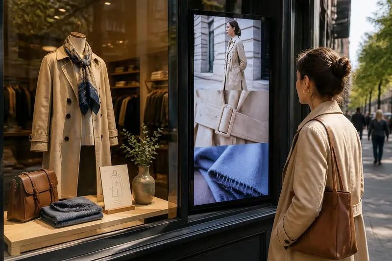
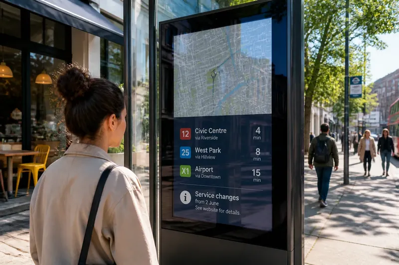
Begin with the screen’s public role, not its technical appearance. A shopfront display can direct attention towards an entrance; a projection may turn a wall into a temporary surface for a shared event. If the message is unclear about its purpose, people may notice the image without understanding what the display contributes to the street.
Write down the single thing a passer-by should recognise. Then check whether the image, wording and placement all point towards it. A venue name belongs near a clear visual cue to the entrance; an event announcement needs to make the event itself more prominent than decorative motion.
Keep secondary details in their proper place. Opening information or a sponsor mark may matter, but they should not compete with the screen’s main public function. Think of a screen as a shop window with one clear display: adding more objects does not make the first one easier to see.
How should a screen relate to its building?
A display changes how a façade is read. It can emphasise a doorway, obscure the rhythm of windows or introduce movement to an otherwise quiet frontage. The question is not whether the screen matches the building in a vague sense; it is whether its position and content help people understand the place.
Consider the screen’s relationship to doors, windows, signs and architectural divisions. A display placed across a shop’s visual entrance may draw attention away from the destination it is meant to identify. A projection that follows the shape of a wall can make the building’s form part of the image rather than treating it as a blank rectangle.
For a shopfront, keep the route into the premises visually distinct from the screen content. For a temporary projection, consider what the image does to the building after the display ends: a design may work with the wall’s features, or make them harder to read. These are compositional choices, not reasons to cover every available surface.
When does movement belong in a street display?
Movement gives a screen a different presence from a printed sign, but it should serve a purpose. A slow change can mark an event or suggest a transition; constant shifts can make a display feel like another source of street noise. The useful distinction is between motion that helps the message and motion that merely announces itself.
Review the sequence as a passer-by would encounter it: in fragments, not from the beginning on command. Ask whether the central idea remains understandable if someone sees only one part of the sequence. If not, make the essential message persist across changes instead of relying on a viewer to wait for the right frame.
For a projection on a civic building, for example, a gradual transition might connect an image to the building’s outline. For a shop window, a rapidly changing sequence may distract from the goods and the entrance. The setting and purpose decide which approach makes sense.
How do you judge whether the screen belongs there?
Ask people who use the place what they think the screen is for, without explaining it first. Their answers can reveal whether the display reads as part of a shop, an event, a public message or an unrelated interruption. This is a conversation about interpretation, not a formal test or a vote on taste.
Say a small bookshop plans a window screen to announce an evening reading. Its starting point is a frontage where the door, books and printed event card are already visible. The shop replaces a fast sequence of author portraits with one still image of the featured book and a short event title, keeping the entrance unobstructed. In a later conversation, if passers-by identify the reading before asking what the moving images mean, the shop has a clearer indication that the screen now supports the event; the trade-off is less visual variety.
Keep the change narrow enough to interpret. If the screen, shop sign and window display all change together, it becomes difficult to know which alteration affected people’s understanding. A clear purpose makes the next decision less mysterious.
What questions help clarify a screen’s public role?
Should a shopfront screen compete with its window display?
Usually, it should support the shop’s offer rather than hide it. If people can identify the goods and entrance alongside the screen, the display is working with the frontage; if not, simplify or reposition its content.
Can a projection make a building part of the image?
Yes, when the composition uses visible features such as arches, columns or window surrounds. If the image ignores those features and makes the wall seem like an unrelated panel, revise the composition to acknowledge the architecture.
How much text belongs on a public screen?
Include only what is needed for the screen’s immediate purpose. If a viewer must stop to understand the main message, move supporting details to a nearby printed notice or another channel.
What if people notice the screen but misunderstand it?
That points to a gap between the display’s intention and its public reading. If people consistently interpret it as advertising when it is meant to announce a community event, make the event identity more explicit and reduce competing cues.
Which details should you review before changing the design?
- Purpose: Check whether the screen identifies a place, promotes an event or provides public information. If people cannot tell its role, revise the main message; otherwise, retain the content and examine its relationship to the frontage.
- Entrance: Check whether the display visually competes with the door. If the entrance becomes harder to pick out, move or simplify the screen content; if it remains distinct, leave the doorway arrangement in place.
- Architecture: Check whether the image acknowledges windows, columns or wall shape. If those features become confusing, revise the composition; if they help frame the image, preserve that relationship.
- Sequence: Check whether the main idea makes sense in a brief encounter. If it depends on seeing several changes, keep the essential message present throughout; if it already stands alone, avoid adding explanatory copy.
- Window display: Check whether the screen hides products or printed information. If those items lose their purpose, reduce or reposition the screen content; if they remain legible as part of the shopfront, keep the arrangement.
- Public interpretation: Check what people think the screen is for before explaining it. If their answers diverge from its intended role, clarify its identity; if they understand it, avoid revisions that add noise without a clear need.
How can you tell whether street screen readability has improved?
Compare the intended purpose with what people can identify and with the way the display sits in its setting. A venue screen should point towards the venue; a projection should make sense in relation to the surface carrying it. A design can be visually striking and still fail at either task.
Street screen readability is not a contest to make every surface louder. It is the fit between a display’s message, its public role and the building or street that carries it. When those parts agree, the screen has a clearer reason to be there—and the pavement keeps some room for everything else.