Shop Window or Digital Display: Two Ways to Hold a Passer-by’s Attention
Shop window or digital display: see how still objects and changing sequences hold attention, and choose a storefront arrangement that suits the message.

The common mistake in a shop window or digital display is asking both to do the same job: show everything at once. A crowded window loses its focal point; a screen that changes too quickly gives a passer-by no time to read. Each can hold attention, but one does it by letting the eye settle and the other by giving it a reason to return.
What does a still window ask the eye to do?
A composed shop window is a single view. Its objects remain in place while the passer-by moves, so attention comes from arrangement: one item stands forward, another supports it, and empty space makes their relationship legible. The scene need not be elaborate. A coat on a mannequin, a folded scarf and a small card can suggest use without competing for equal notice.
Stillness also lets a viewer choose the pace. Someone walking past can catch the outline of the coat; someone waiting nearby can notice its fabric, the scarf’s colour and the card’s wording. The window does not have to hurry either person along. It behaves a little like a well-set table: the objects stay put, and the arrangement tells you where to look first.
Visible objects carry more than their labels. A ceramic cup beside a bag of coffee beans makes a product pairing apparent; a stack of identical cups suggests a range or a gift. These objects can make a shop’s offer tangible from the pavement, especially when reflections, daylight and the view into the shop are part of the composition rather than distractions to be hidden.
How does a digital display use sequence?
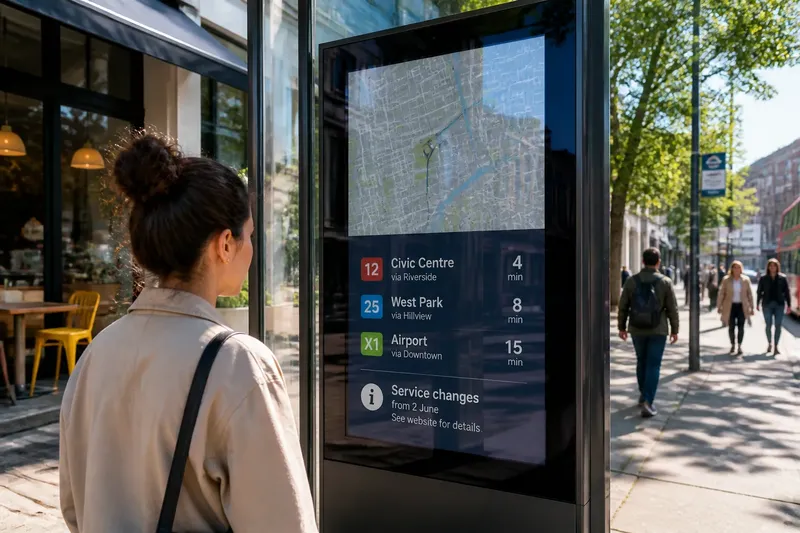
A digital display can change what it shows without changing the physical window. It may present a product close-up, then a line of text, then a quieter frame. That sequence creates an order in time: the viewer sees one part before another, much as a sentence reveals its meaning word by word. Unlike a static arrangement, it can introduce motion, but motion is not automatically a reason to look.
The useful question is what each change contributes. A gentle transition from a whole garment to a detail can help a passer-by notice the stitching. A sudden switch to an unrelated offer may reset attention instead, leaving neither message complete. If the display loops, the beginning and end matter too: someone arriving halfway through should still be able to understand the central offer without waiting for the whole sequence.
Sequence can also lend a screen the quality of a small performance. An object appears, changes context or is paired with another image, and the viewer follows that development. This can suit a message that depends on comparison or transformation. It is less useful when the point is simply that a particular object is available: a clear, steady image may do that with less effort.
Which format suits the message?
Start with the thing a passer-by should notice, not with the technology available. A physical object earns its place in a window when shape, texture or scale helps explain the offer. A digital frame is more suited to information that benefits from an ordered reveal, such as a product shown in several contexts. Neither format needs to imitate the other.
- Choose a composed window when the object itself is the evidence: its silhouette, material or relationship to nearby products is part of the appeal.
- Choose a changing display when the message needs distinct scenes, a short sequence or information that cannot be conveyed by one view.
- Use both selectively when the physical item gives the screen something specific to interpret. Keep the screen’s role distinct, rather than showing a duplicate of the object beside it.
Say a bookshop wants to draw attention to a new illustrated atlas. It could place the open book in the window with a map visible, letting the paper and scale carry the message. Or it could use a display to move from the cover to a map detail and then to a shelf view. The expected observable difference is that the first arrangement holds one recognisable scene, while the second asks the passer-by to follow a short progression. If the screen merely repeats the cover, the physical book is likely to say more.
How should stillness and change share a window?
A mixed display works best when the objects and the screen have separate jobs. Let a real product establish presence; use a digital image to reveal a detail or setting that the physical display cannot show. For instance, a shoe can remain on a plinth while a screen shows it worn on different surfaces. The shoe supplies a stable point of reference; the sequence supplies variation.
Give the eye a place to rest between changes. A screen that is active in every part of a window can make the objects feel like background props. A still frame, a pause or a simple transition can restore the sense that the physical arrangement matters. The screen need not be silent in the literal sense; it needs to avoid insisting that every moment is the important one.
Also consider what the passer-by can see from an angle. Glass reflects pavement and sky, and a moving image may become harder to follow as the viewer approaches or turns. Physical objects retain their shape from more viewpoints, although their details can still disappear behind glare or crowded dressing. The useful comparison is not “real versus digital”, but which parts of the message remain readable during an ordinary walk past the frontage.
What should you ask before choosing?
Does a shop window work better than a digital display?
It depends on what the viewer needs to understand. A window suits objects whose physical presence carries meaning; a display suits messages that gain from ordered change. If the offer is clear in one view, movement may add little.
How long should a digital display sequence be?
Keep it as short as the message allows, with each frame contributing something distinct. A passer-by may see only part of a loop, so the main point should not depend on catching its opening.
Can physical products and screens appear together?
Yes, if each contributes different information. A visible product can anchor the scene while the screen shows a detail, use or context that the object alone cannot reveal.
What makes a shop window easy to read?
A clear focal object, deliberate spacing and a visible relationship between products help the eye settle. Keep text brief enough to read at a glance, and avoid arranging every item as though it deserves equal billing.
How can you judge the result from the pavement?
Look at the frontage from the approach a customer actually takes, then notice what registers first and what remains visible as you pass. Check whether the physical object can be recognised through reflections, whether a screen’s message survives a partial view, and whether the two formats appear to tell one story or compete for the same glance. Where the right choice depends on display equipment, product handling or local requirements, follow the relevant manufacturer instructions and rules.
The central decision in a shop window or digital display is whether attention should settle on an object or travel through a sequence. Make that choice before adding props, text or motion. A frontage becomes easier to read when its still things are allowed to be still and its moving images have somewhere definite to take the eye.