The Brightness Trap: More Light Does Not Make a Message Clearer
Screen brightness can make a display more conspicuous, not clearer. Learn how contrast, reflections and ambient light affect public-screen legibility.
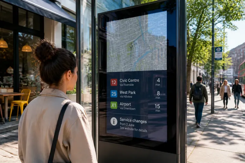
The common mistake with an unreadable public screen is to turn up its brightness. The brightness trap is that a more conspicuous display can still leave its message indistinct, because light output cannot repair weak text-background separation or a reflection across the image.
Why can more brightness reduce legibility?
Brightness describes how much light a display emits; contrast describes how clearly its parts differ. Pale lettering on a pale field may remain hard to distinguish when both are made brighter. A reflection can flatten the image further, laying a sheen over the pixels like a sheet of tracing paper over a printed notice.
That sheen may come from a shop window, the sky, a street lamp or vehicle lights. Raising the display output does not remove it. The screen may attract attention while its route name, opening notice or instruction remains difficult to read.
How does ambient light change contrast?
Light falling on a screen can make its dark areas appear less dark. After dusk, the same display may seem much brighter because the surrounding scene is dimmer. A setting that blends into a busy daytime street can dominate a quiet pavement later.
There is no single text-and-background pairing that works in every setting. Dark lettering on a light field may read clearly in one place, while a light-on-dark design may be easier to distinguish elsewhere. Reflections, surface finish and the light around the screen all affect the result.
What can the image design fix?
Clear edges and simple structure often matter more than maximum output. Use recognisable letterforms, give words room to stand apart and avoid relying on colour differences alone. If smaller wording disappears while a heading remains clear, adding brightness may only make the heading more dominant.
Say a café menu beside a sunlit window uses pale grey lettering on white. The starting problem is that the menu’s words blend into the background. The operator changes the lettering to a dark tone, keeps the background light, and checks the result from the pavement; the expected visible change is clearer letter outlines, while any reflected patch remains. That distinction shows what the design has improved and what it has not.
Which questions help identify the cause?
Does the problem change when the viewer moves?
If a bright patch shifts across the image as someone changes position, reflection is likely obscuring the content. If the letters remain indistinct in places without that patch, the design may also need stronger separation.
Does the text blur even without a reflection?
Persistent difficulty separating letters from their background points towards weak contrast, fine strokes or crowded wording. A clearer tonal pairing or simpler copy may help more than a brightness adjustment.
Why does the display look different after dusk?
The surrounding scene has become dimmer, so the screen may stand out more strongly. Check whether its content remains readable without overwhelming the immediate setting.
Can a less reflective finish solve the problem?
It may reduce visible reflections, but it cannot correct weak text-background contrast or crowded content. The screen still needs to be judged by what its surface and image allow viewers to see.
What should you check before changing a setting?
Separate image design, reflections and brightness rather than treating them as one problem. Use these checks to choose a relevant next action:
- Letter outlines: Check whether the important words have distinct edges. If letters merge with the background, revise the tonal pairing; otherwise, leave the colour relationship alone and inspect other causes.
- Small wording: Check whether secondary text can be distinguished from the intended viewing position. If it disappears, enlarge or shorten it; if it remains clear, do not simplify it merely to address a reflection.
- Reflected shapes: Check whether windows, lamps or the sky appear over the message. If they obscure words, consider a less reflective finish or a different screen orientation; if they do not, focus on the image itself.
- Daylight appearance: Check whether the display loses separation when the surrounding area is bright. If so, review contrast and the screen’s light response; if not, avoid raising output on the strength of a different lighting condition.
- After-dark appearance: Check whether the screen dominates its surroundings when ambient light falls. If it does, review its brightness control; if it does not, leave the setting alone and investigate any remaining text or reflection issue.
- Message length: Check whether the main instruction can be grasped without prolonged reading. If it cannot, shorten and organise the copy; if it can, retain the wording and address the visible obstacle instead.
When is automatic brightness useful?
Automatic adjustment can help a display respond to changing ambient light, but it cannot fix a reflective location or poorly separated text. In daylight, more output may still leave direct sunlight across the screen. After dark, a fixed high setting may make an otherwise legible display needlessly dominant.
Check the display during the conditions it encounters, including the transition around dusk. Follow the manufacturer’s instructions and applicable local rules. If a public screen could affect traffic visibility or safety, the responsible operator should ask a qualified specialist before changing its configuration.
What is the first useful adjustment?
For the brightness trap, identify whether the visible problem is a reflection, weak contrast or an unsuitable brightness setting. Change the factor that accounts for the poor reading, then check whether the specific obstruction has changed. A brighter display is not the default answer just because the control is easy to reach.
Keep the aim modest: let the message remain distinct without making the whole street attend to it. For public-screen brightness, that means judging the image’s edges and contrast alongside its emitted light, not asking one setting to do every job.